I build websites for a living, and as a web designer I come across all kinds of cases every day: from brand-new projects to rescuing sites that were “supposed to work” but in reality scare visitors away. If you have a website or are planning one, this article will help you avoid the most common website design mistakes, the ones that often mean a site simply… doesn’t work.
No clear structure
One of the problems I see most often is chaos. Sites without a logical structure feel like a maze: visitors don’t know where to click, how to go back or how to contact you. Sometimes the homepage doesn’t contain a single clear message about what the company actually does. When I build professional websites, I always start with a clear information architecture and a readable menu. Visitors need to feel confident that they’ve landed where they wanted to be.
Outdated design and no mobile version
Sometimes I come across sites that look exactly the way they did 10–15 years ago. Loud backgrounds, flashing elements, fonts straight out of Word 2003. The biggest sin, though, is not adapting the site to mobile devices. More than half of website traffic now comes from smartphones. If your site “falls apart” on a phone, people will simply leave. That’s why regular website updates matter so much: they keep your site looking modern and fully functional.

Slow loading
People don’t like to wait. If your website takes more than 3 seconds to load, you risk losing most of your visitors. The usual culprits are oversized images, unoptimized code or an overloaded server. When checking a website, it’s worth running a PageSpeed Insights test and acting on its recommendations. I always start by compressing images, reducing the number of scripts and setting up caching.
No basic SEO
Many website owners tell me: “I have a website, but nobody visits it.” Most often that’s the result of missing search engine optimization. Without well-chosen keywords, headings, meta descriptions and page names, Google simply won’t see your site. Designing a website without SEO is like building a shop in the middle of the desert: it’s there, but nobody will find it.
Outdated content and dead links
I’ve come across sites where the “News” section had its last post from 2018, and clicking the link to “Services” led to a 404 error. That’s not just off-putting, it undermines your credibility. Keeping your website up to date isn’t a luxury, it’s a necessity. Both customers and Google’s algorithms pay attention to how fresh your content is.
Buttons and links that don’t work
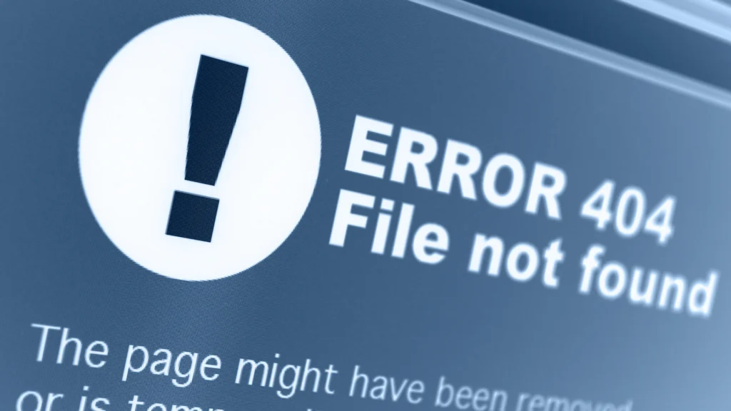
This is a mistake I see all the time. You tap the “Call now” button and… nothing happens. Or some strange, empty link opens. It’s even worse when the site links to pages that no longer exist and the visitor lands on a “Page not found” message. A small thing like that can wreck trust. When I design websites and online stores, I always test every element: every link, form and icon. If a button is supposed to make a call, it has to work. If it leads to your offer, the offer has to be there. Sometimes all it takes is an old, disconnected phone number on the site to lose a potential customer. Small mistakes like these are like holes in a bucket.
No clear call to action
Even a beautiful website is useless if it doesn’t lead visitors toward a goal. All too often I see sites without a contact form, a “Buy now” button or even a phone number. And when they are there, they’re tiny, gray and right at the bottom of the page. On a well-designed site, the call to action (CTA) should be visible straight away. Buttons need to be large, readable and in a contrasting color. I regularly come across sites where the “Call now” button is 10px in size, blends into the background and doesn’t work on mobile. Avoid that.
Too little content, or too much filler
Some website owners try to say everything on one page: thousands of words, a dozen sections, dozens of photos. Others write nothing at all: just a logo, one sentence and a phone number. Good website design gives specific information in a simple way. What you do, how you can help the customer, what it costs, how to get in touch. Without that, there’s no point.
Confusing navigation and hidden menus
Another trap. A menu hidden behind some unusual symbol nobody understands. Or you click “Services” and a list of twenty items drops down, with no rhyme or reason. In online store design it’s especially important that a customer can reach a product and order it in 2–3 clicks. If they have to figure things out, they give up.
No links to social media
If you run a business profile on Instagram or Facebook, give people a quick way to get there. Many of my clients forget these simple links, yet they’re a great way to build relationships and trust. Links to your social media profiles should be standard.
No SSL certificate or security
This is one of the biggest red flags. If your website doesn’t have an SSL certificate (meaning it doesn’t load over “https”), the browser may mark it as not secure. To a visitor, that’s a signal: “better not go in here”. On top of that, poor security is a risk for you too: attacks, break-ins, spam. That’s why website maintenance covers not only content but also plugins, themes and security.
Summary
Building a good website takes more than good looks. It’s a well-thought-out process where every detail counts: from speed and SEO to working buttons and forms. If you suspect your website isn’t performing the way it should, get in touch. At ITPER, I specialize in designing websites, updating and optimizing them, and in website repair and website refreshes. Together we’ll find solutions that make your site attract customers instead of scaring them away.
Take the first step: let’s check your website together.